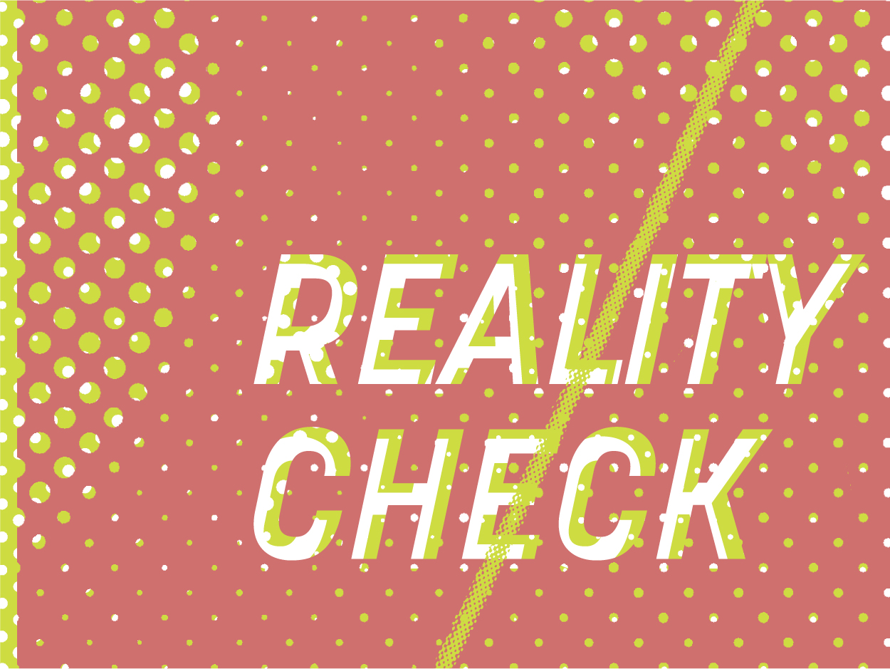
Reality Check
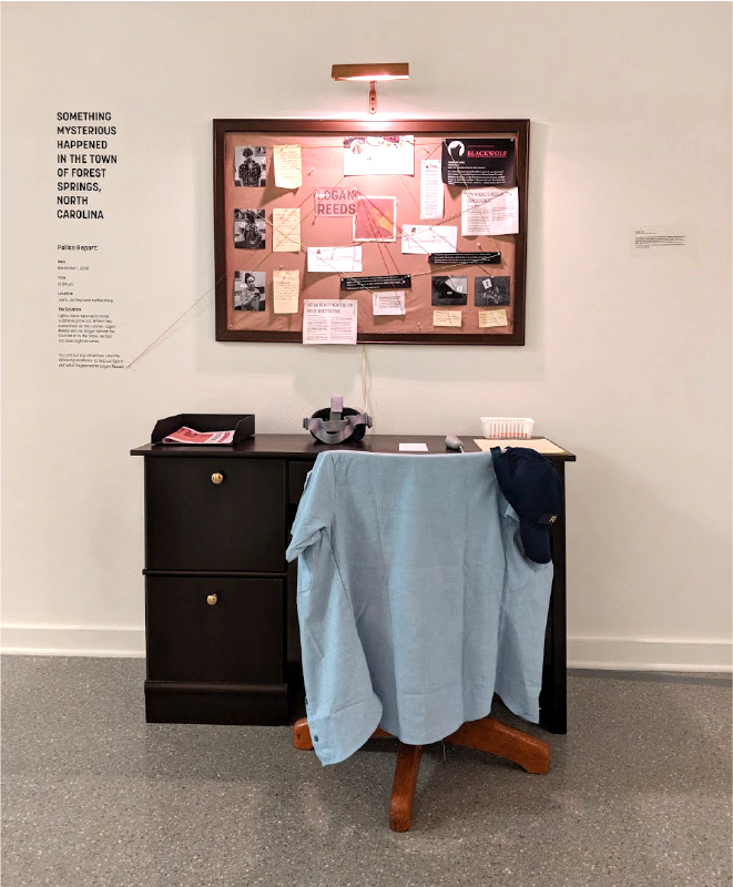
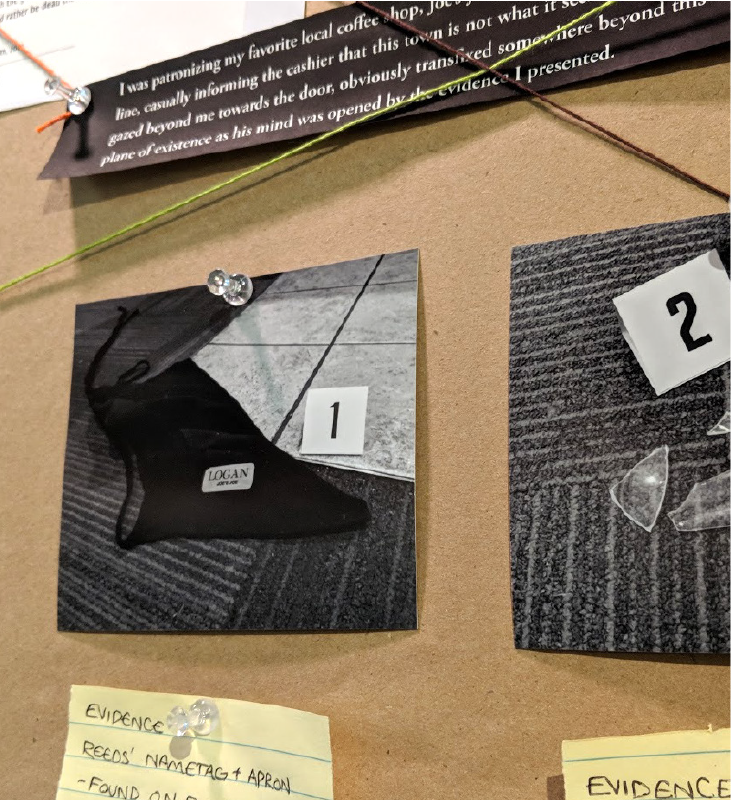
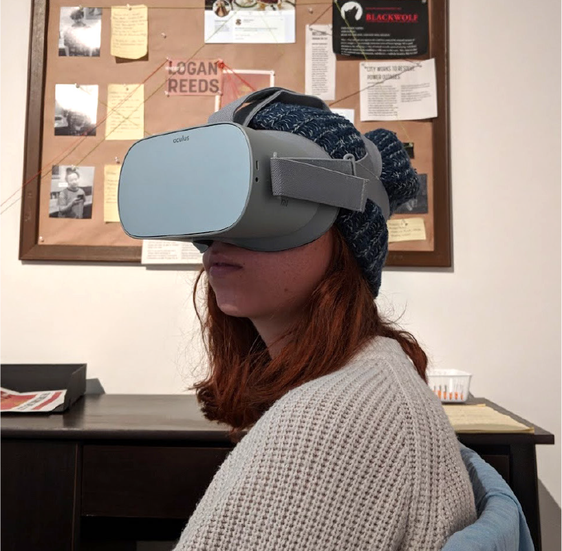
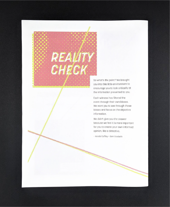
Created in collaboration with Sam Goodwin, this multimedia project uses the form of a detective style game to stress the importance of media literacy and critical thinking. Through it, visitors are placed in the role of a small town detective examining evidence from a range of media: text from various sources, photo evidence, and a VR video of the crime scene.
- Date Fall 2018
- Collaborator Sam Goodwin
- Exhibition Chew On It BFA Graphic Design Exhibition, Smith Gallery Boone
- Project type VR video + mixed media
- Fonts used Korolev, Bio Sans
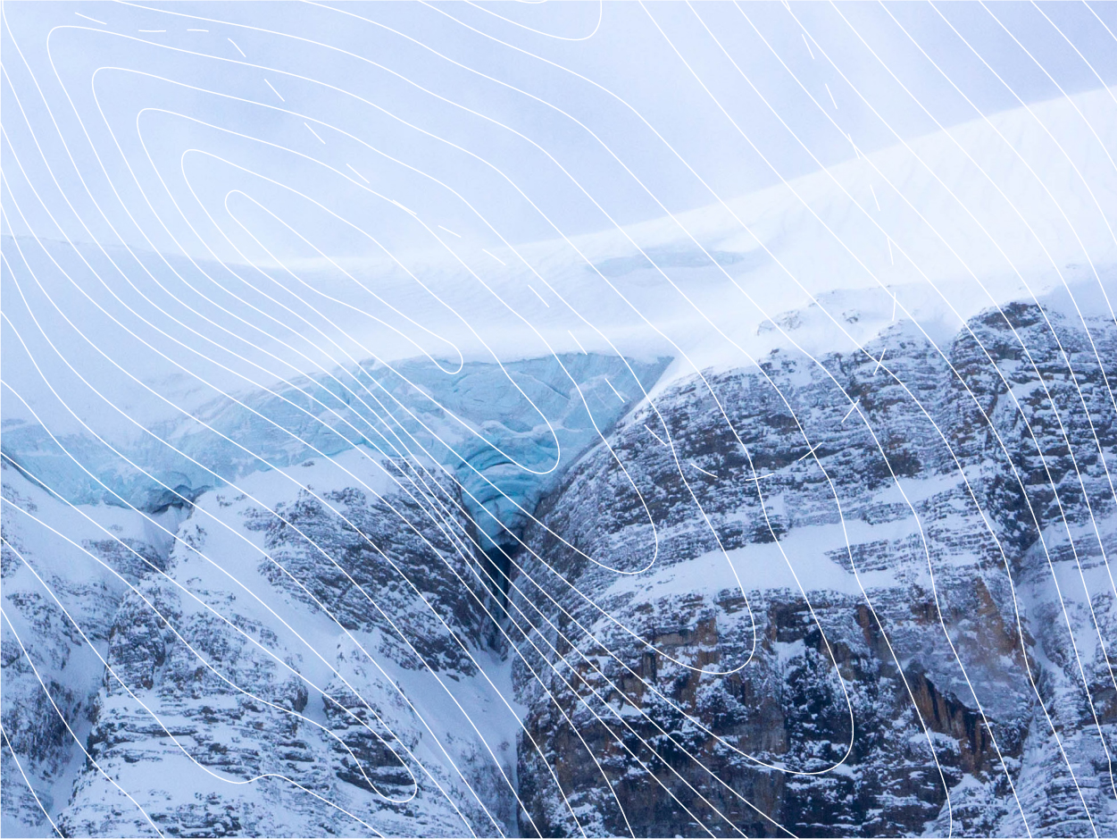
Above is the the VR video which shows the crime-scene as well as police interviews with eyewitnesses at the scene. Alternately, it can be viewed here.
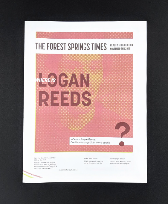
The project was displayed at our senior graphic design class’ BFA Exhibition. Above is the newspaper, given as a takeaway for visitors to the design snow.
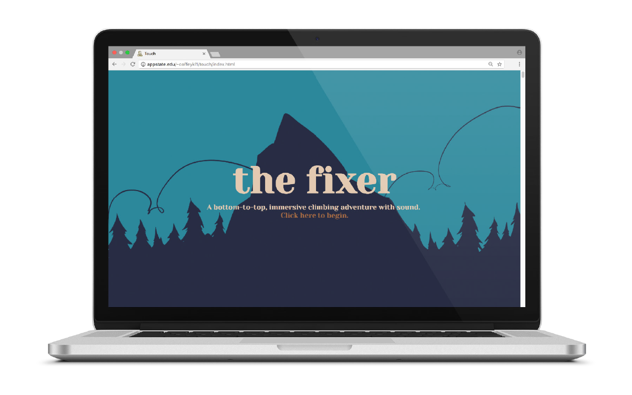
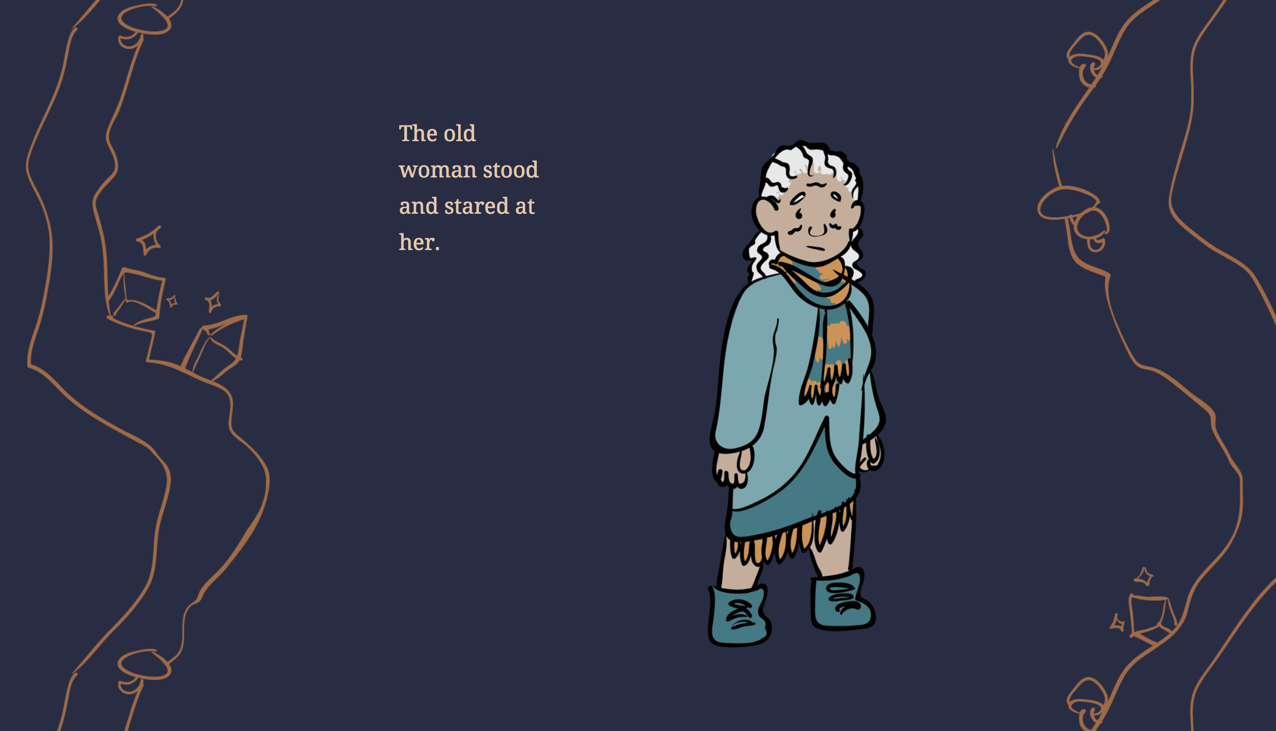
“The Fixer” Website
This website was an experiment to create a unique experience through sound, illustration, animation, and text. It tells a story of a girl who climbs a mountain in hopes of finding a cure for a curse that’s been placed upon her.
- Date Spring 2018
- Client none/class project
- Project type web design + illustration
- Fonts used Yeseva One, Noto Serif
- Outside content laptop template designed by Freepik https://www.freepik.com/free-psd/laptop-mock-up-design_1041411.htm
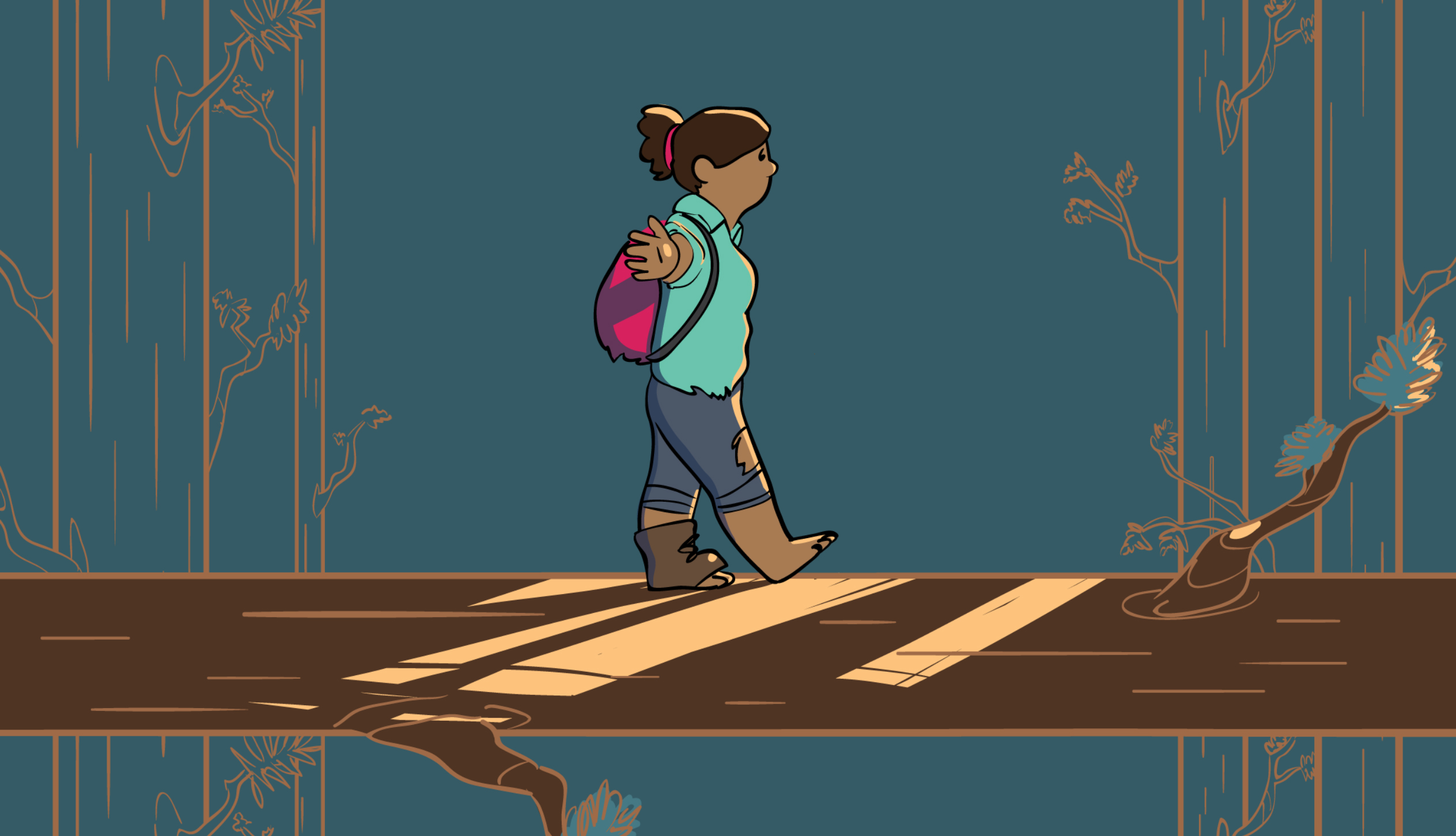
The story goes from bottom to top, and to experience the story, the website’s user scrolls upwards to give the feeling of climbing the mountain.
At different waypoints a sound plays to illustrate what’s happening in the story, such as an earthquake, a tree falling, or the atmospheric noise of the inside of a cave. A parallax scroll in the background moves at a leisurely pace, slowing the speed of the story and encouraging the user to not rush through, but take things at a stroll.
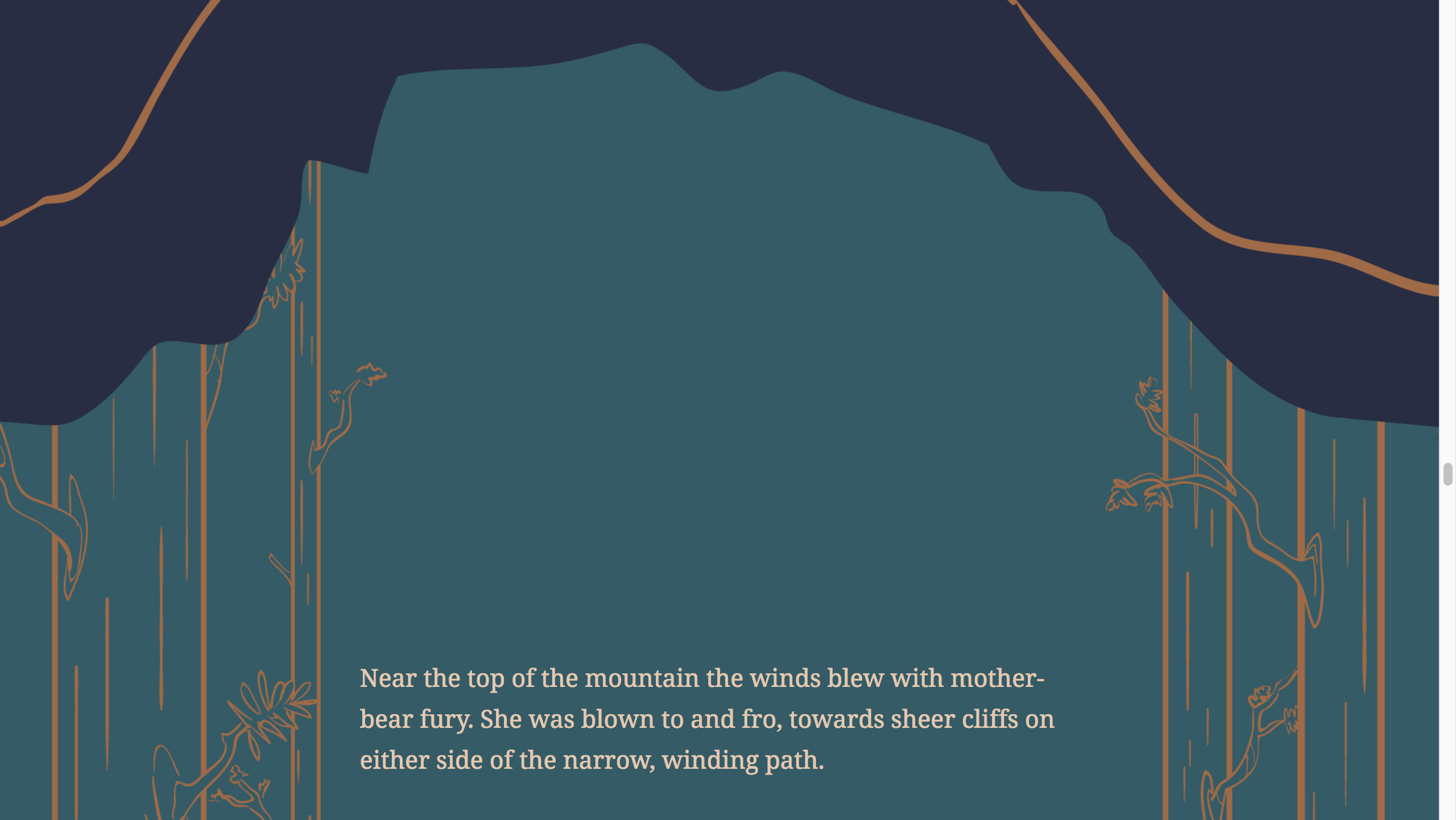
The text and image are meant to invoke a storybook feel, as the story is one that can be enjoyed by all ages.
The website can be viewed here.
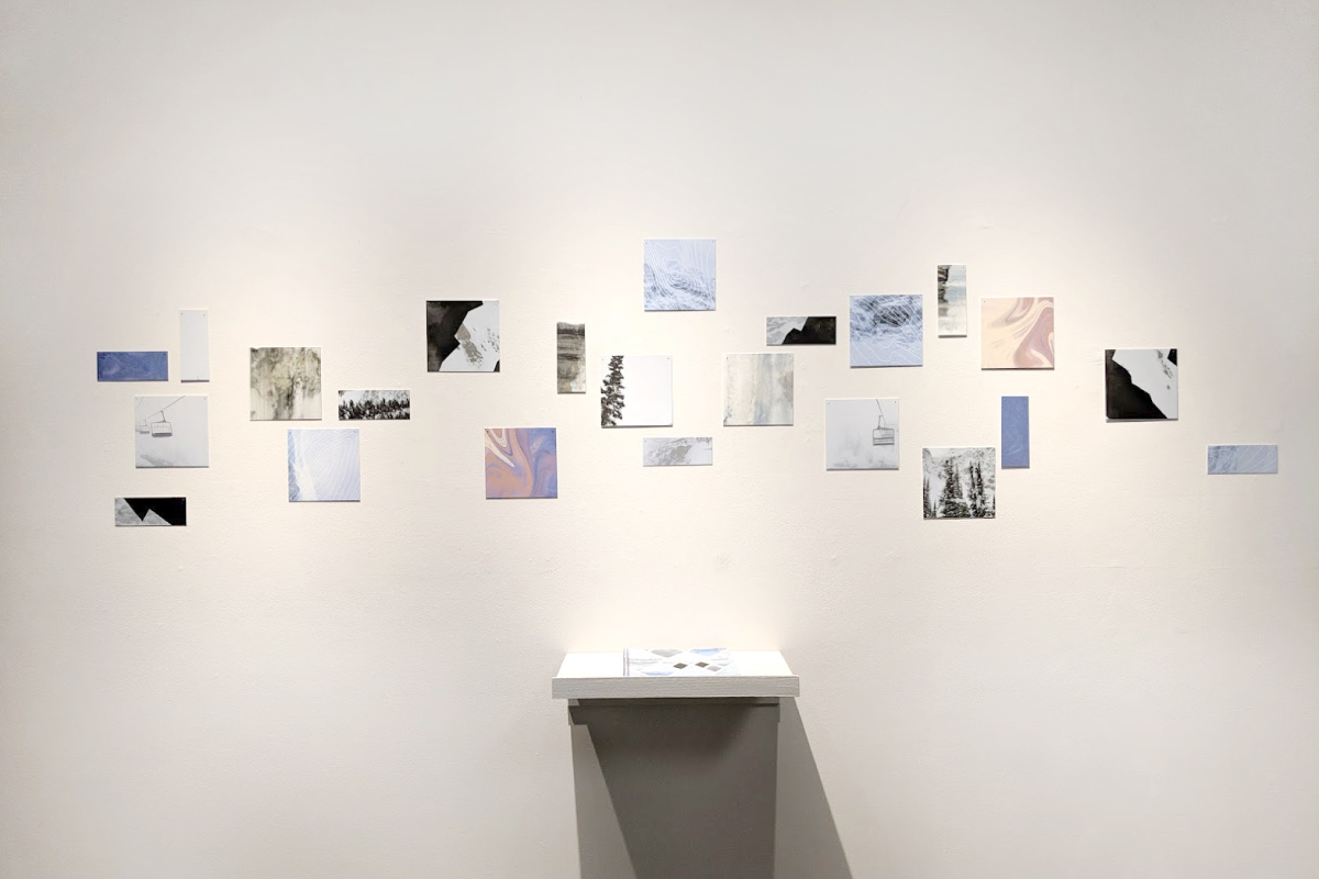
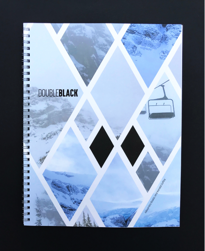
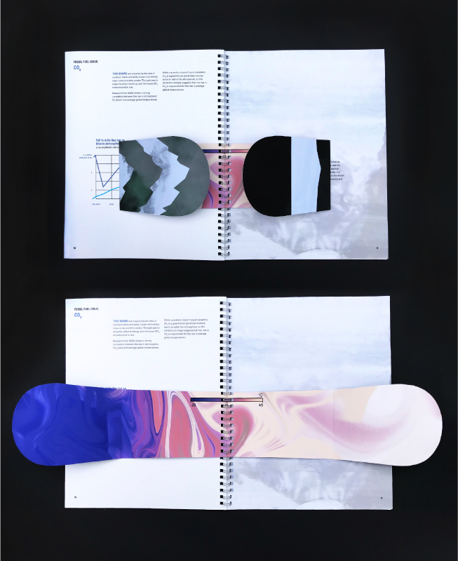
Double Black
Created in collaboration with Alexandra Bostic, this project that uses snowboards to discuss the environmental impact of the ski and snowboard industry. The main issues we focused on are disturbance to flora and fauna, deforestation, and water use by the industry and the impact of unseen side effects of these issues.
- Date Fall 2018
- Collaborator Alexandra Bostic
- Exhibition Chew On It BFA Graphic Design Exhibition, Smith Gallery Boone
- Project type book design
- Fonts used Korolev
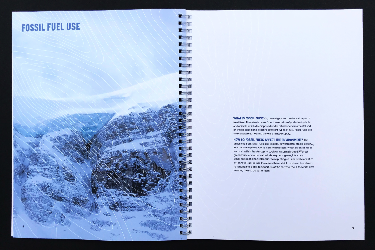
The book highlights these issues, and provides ways that anyone involved in outdoor recreational communities can live responsibly and protect the activities they love.
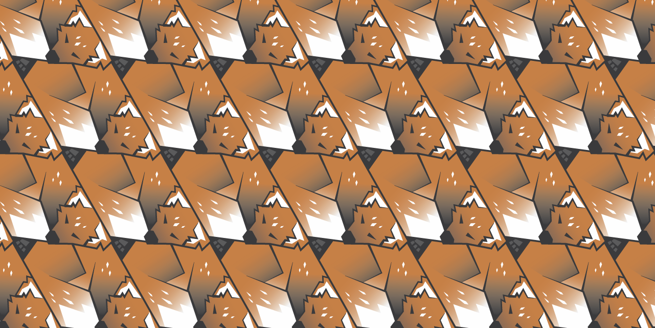
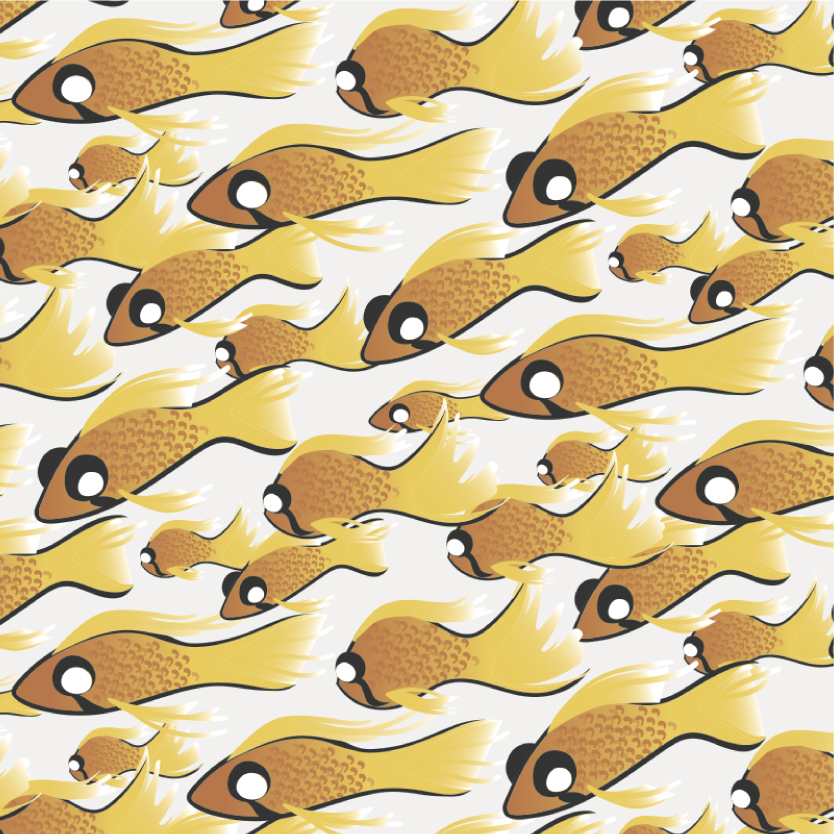
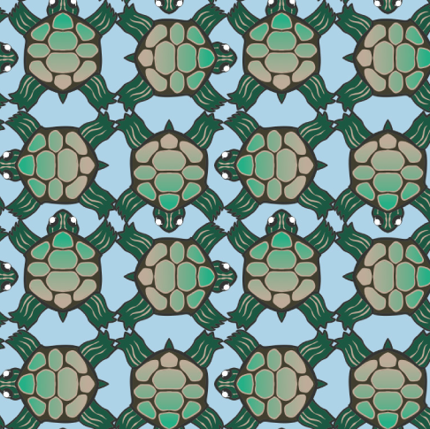
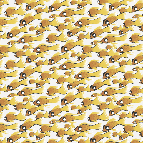
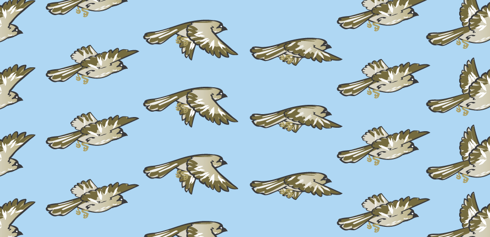
Animal Patterns
For this project, I created endlessly repeating patterns based on four different animal groups: fish, mammals, reptiles, and birds. Each pattern has a different style: random, geometric, symmetrical, and organic.
- Date Winter 2017
- Client none/class project
- Project type llustration
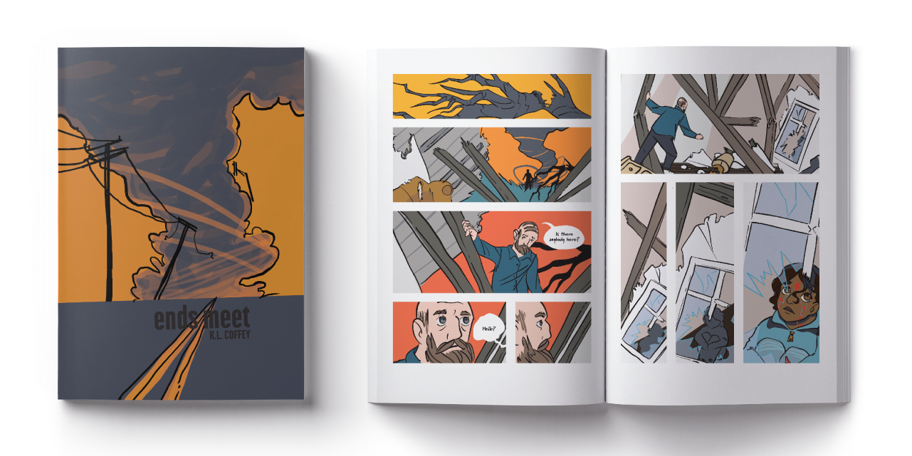
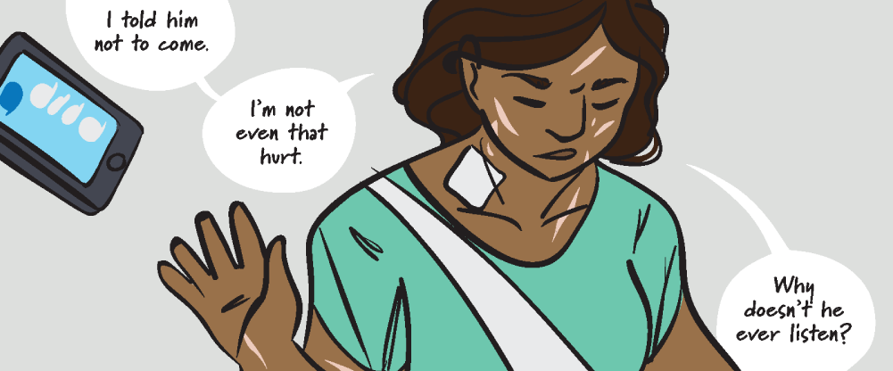
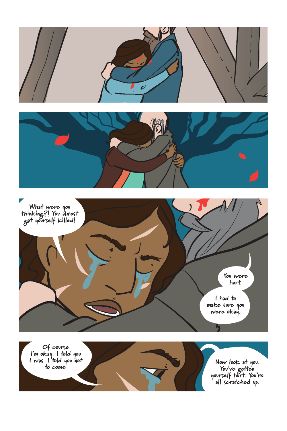
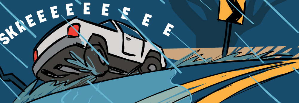
“Ends Meet”
The goal of this project was to design a minimum 12-page illustrated book. For my book, I chose to write and illustrate a short story about an old man and young woman, who share a strong bond due to a painful event in their past.
- Date Winter 2017
- Client none/class project
- Project type book design + llustration
- Fonts used Korolev, Marydale
The title, Ends Meet, comes from the idea of what one needs to survive, and what one can live without. It also doubly refers to the idea of two unconnected elements, or two people, coming together. Two ends meeting.
I combined text with flat color and bold lines to create a classic comic-book inspired style, but made it my own with bold sans-serif sound-effects, a looping handwritten typeface for the dialogue, and stark, borderless boxes against white page-margins.
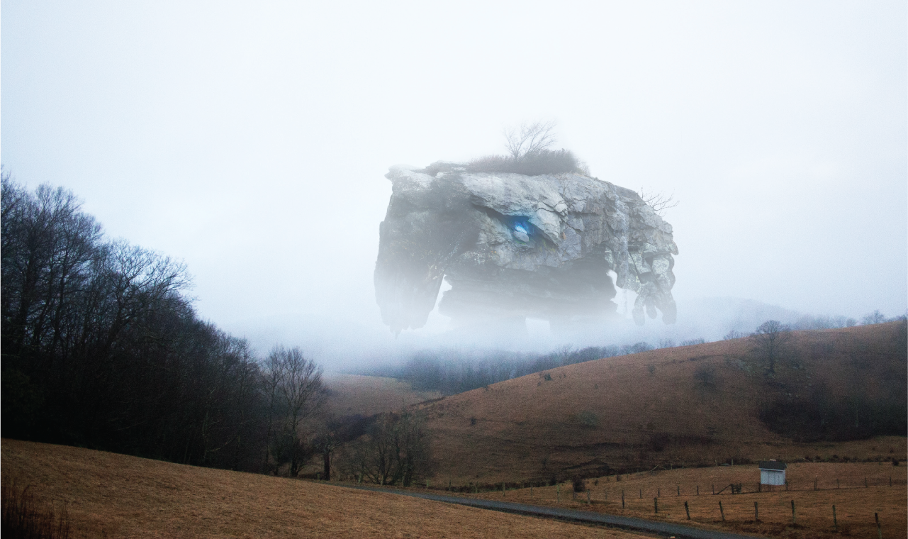
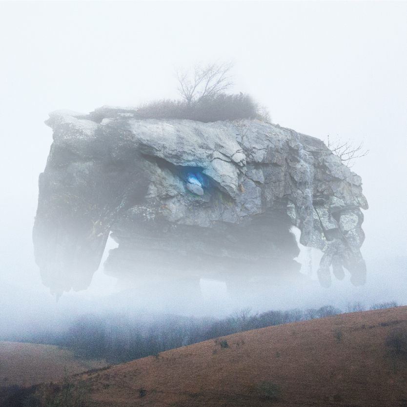
The Mountain
This image combines seven of my own photos to create a mysterious mythical titan emerging from the fog.
- Date Spring 2017
- Client none/class project
- Project type photo manipulation
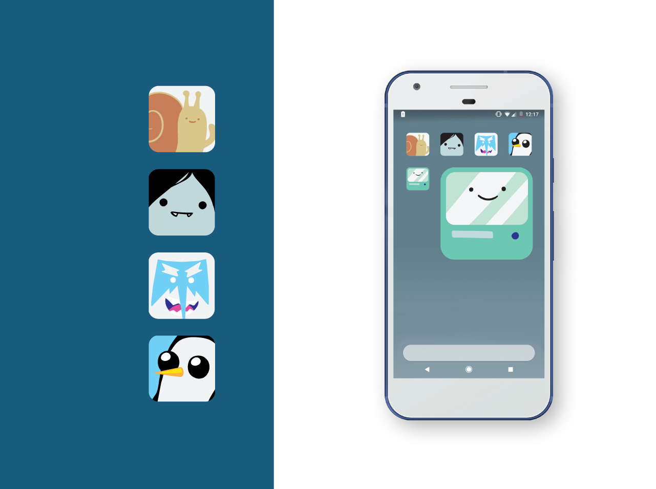
Adventure Time Icons
The goal for this project was to create phone app icons to represent a TV show. One who knows of the show should immediately recognize the icons.
I chose five unique characters from Adventure Time to turn into icons, and kept my colors and illustration style simple to accommodate the size constraint and match the spirit of the show.
- Date Winter 2017
- Client none/class project
- Project type icon, llustration + graphic design
- Outside content Adventure Time characters © Pendleton Ward and Cartoon Network; Phone Template Designed by Daniel Bolyhos dribbble.com/dxbolyhos
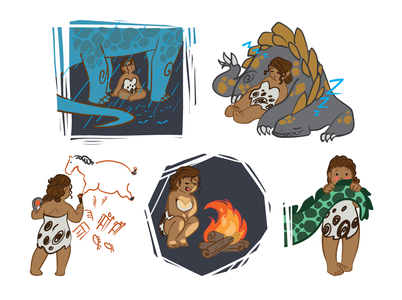
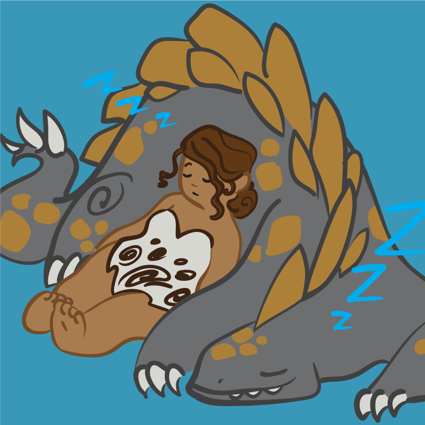
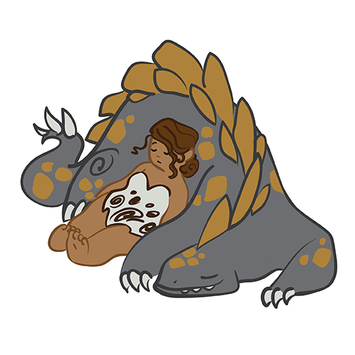
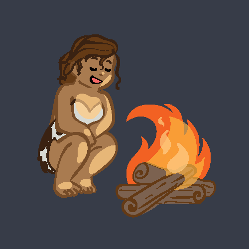
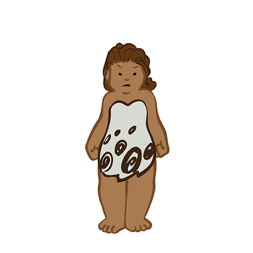
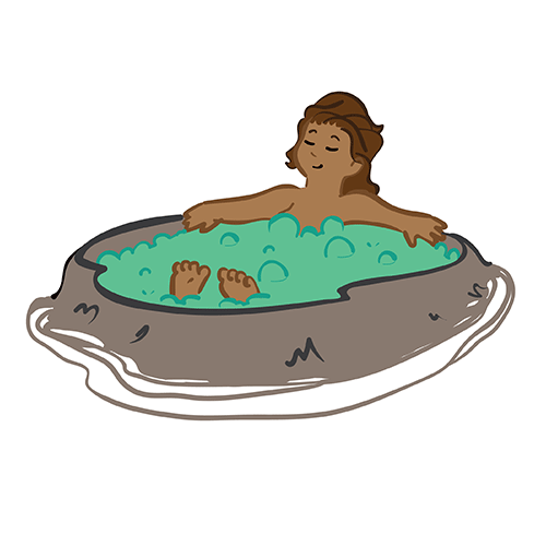
Cavegirl Stickers
The goal of this project was to create “stickers” featuring an original character, for use in social media and chatroom settings.
Unified colors and illustration style, and a range of different expressions were both key aspects of the assignment.
- Date Winter 2017
- Client none/class project
- Project type illustration
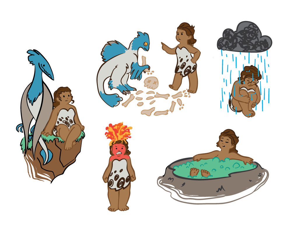
For this set, I imagined a cavegirl interacting with different prehistoric surroundings—such as dinosaurs and cave art. I wanted to give a feeling of discovery and fun. I also tried not to focus so much on different emotions like sticker sets normally do, but on unique scenarios and interactions.

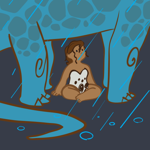
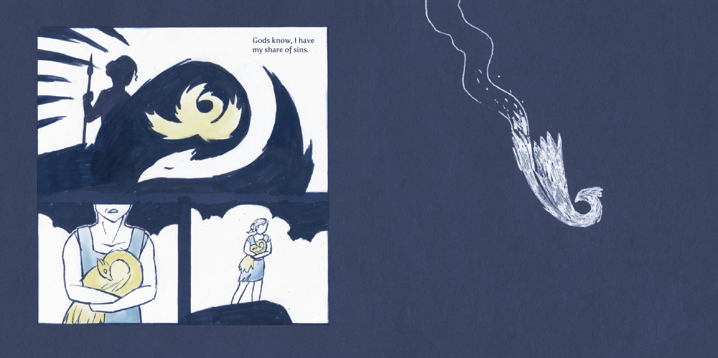
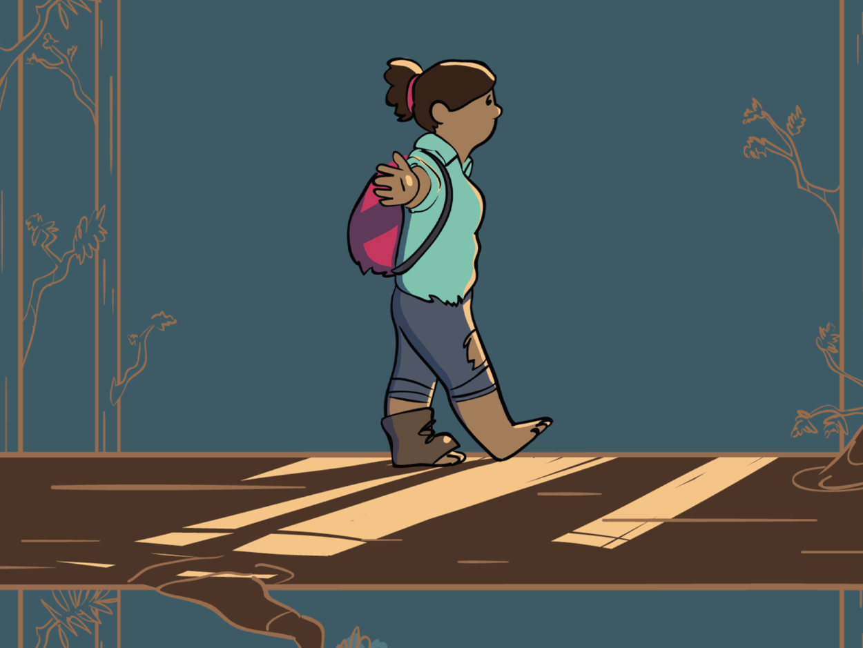
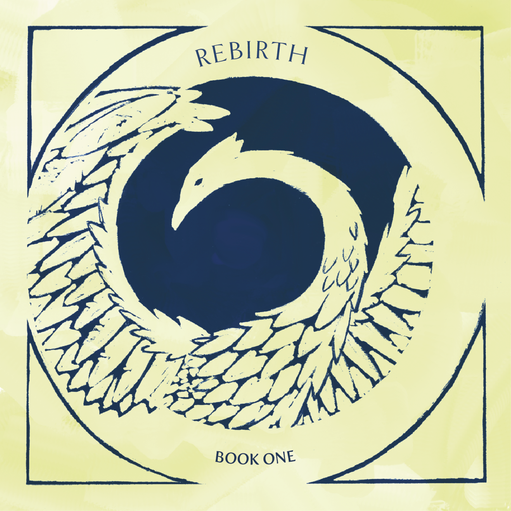
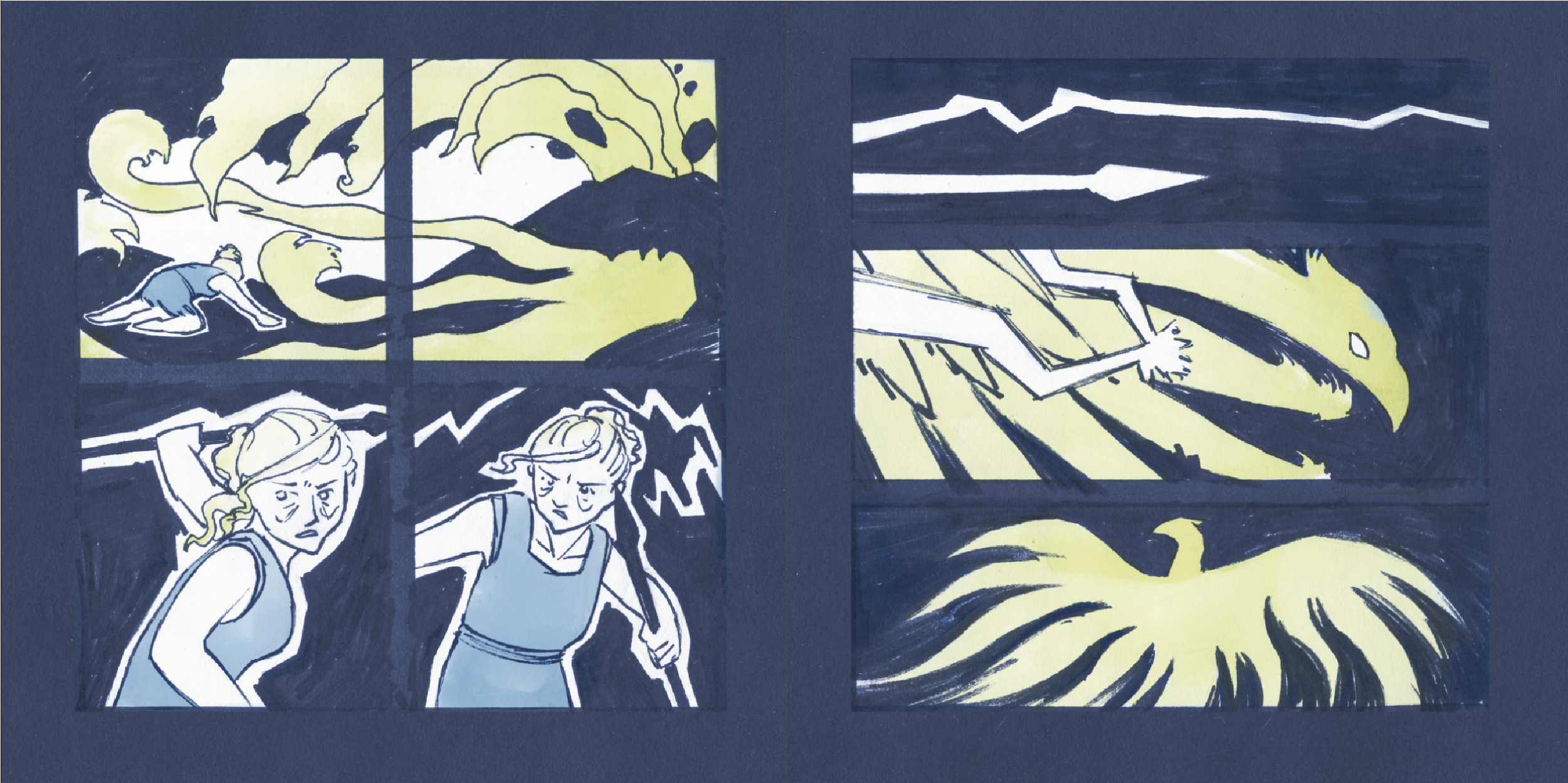
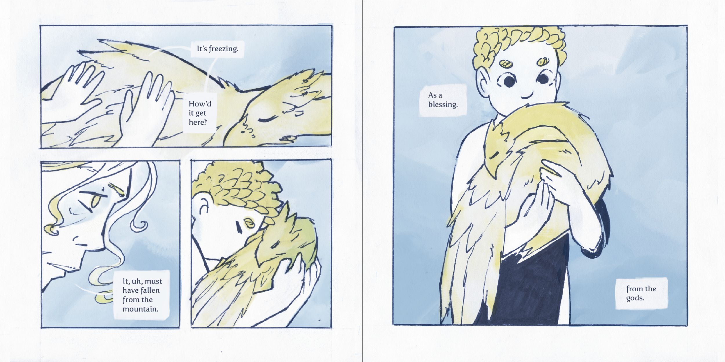
Rebirth Comic
This project was chapter one of a comic that follows a young boy trapped in the same cycle of war and violence as his forefathers, and his teacher who cynically watches as those cycles lead to desctruction. It explores the question: “Are we doomed to watch history repeat itsself, or do we have the choice to break the cycle?”
- Date Fall 2018
- Client none
- Project typeillustration + book design
- Fonts used Goldenbook, Fertigo Pro
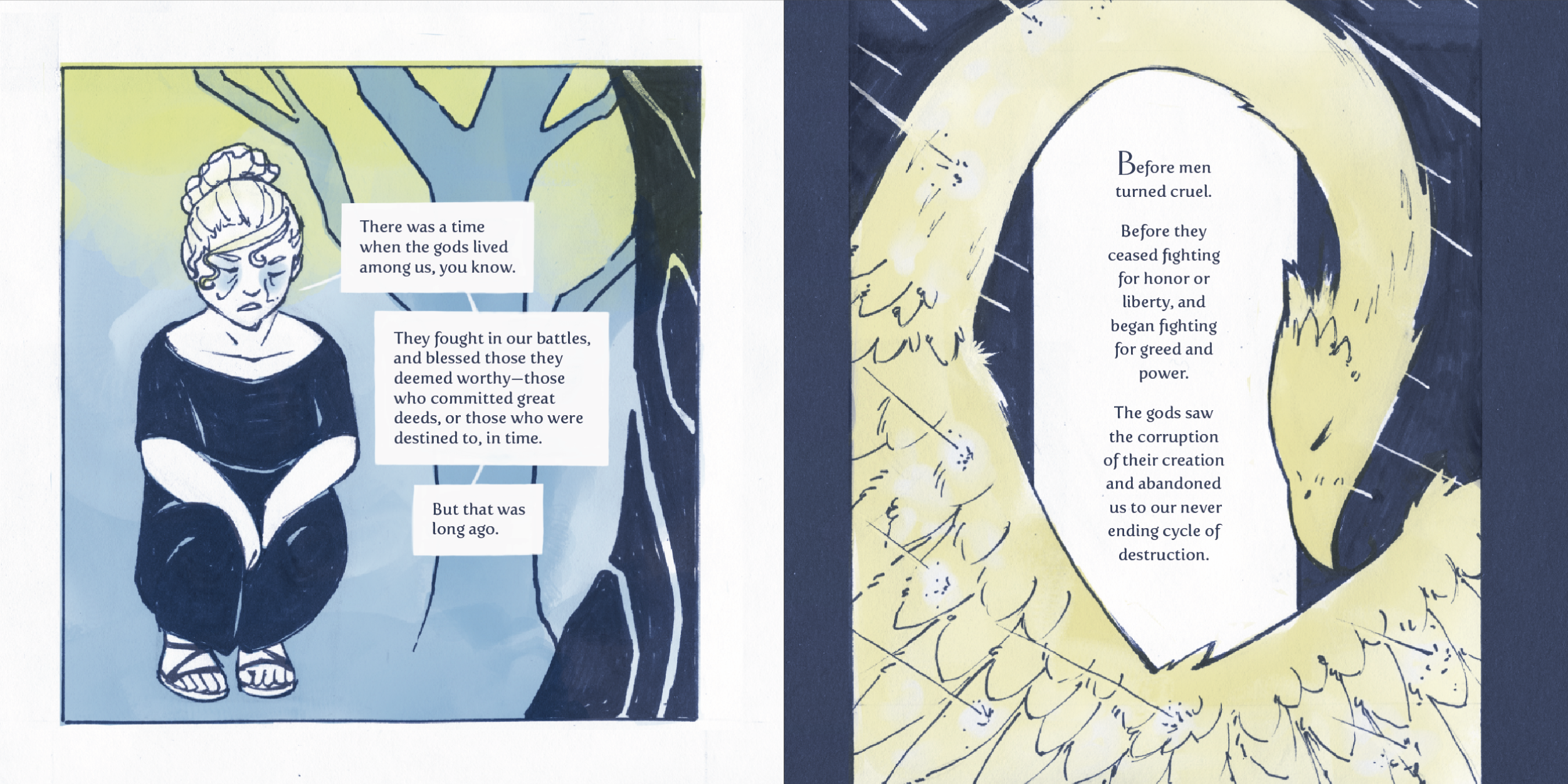
The book's illustrations are mostly simple, but detailed when necessary to emphesize a certain detail, or encourage the reader to slow down on a cetain page.
I used a limited color scheme throughout, which sets the tone for the book and keeps a very consistent look from page to page. By using heavily contrasting colors, I had the veratility needed to show both night and day with one color scheme.
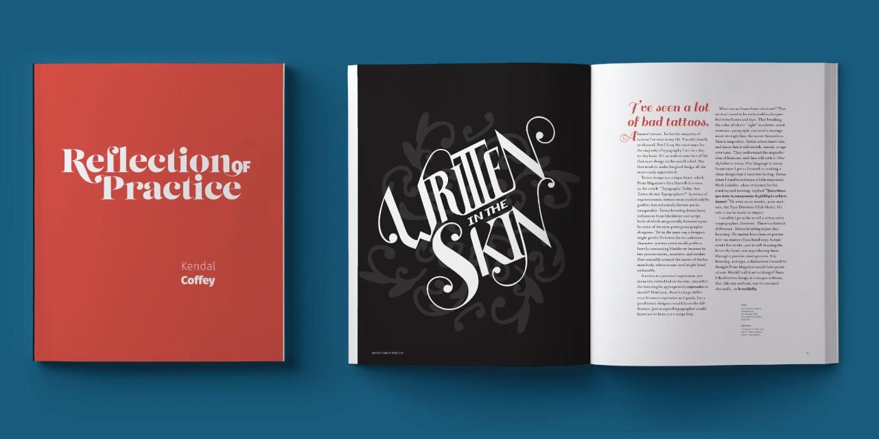
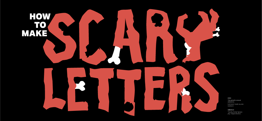
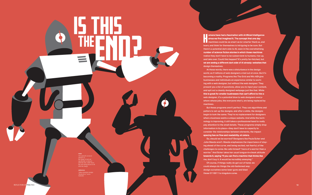
Reflection of Practice
The goal for this project was to create 10 typographic spreads based on 10 readings related to typography.
For each spread, I strove to do something I wouldn’t normally do in a design. In the above spread I experimented with hand-drawn letters.
- Date Winter 2017
- Client none/class project
- Project type book, 8.5"x11"
- Fonts used Lust, Fira Sans, Sail, Mrs. Eaves OT, Aktiv Grotesk, Fresno
- Outside content Book template designed by Pixeden www.pixeden.com
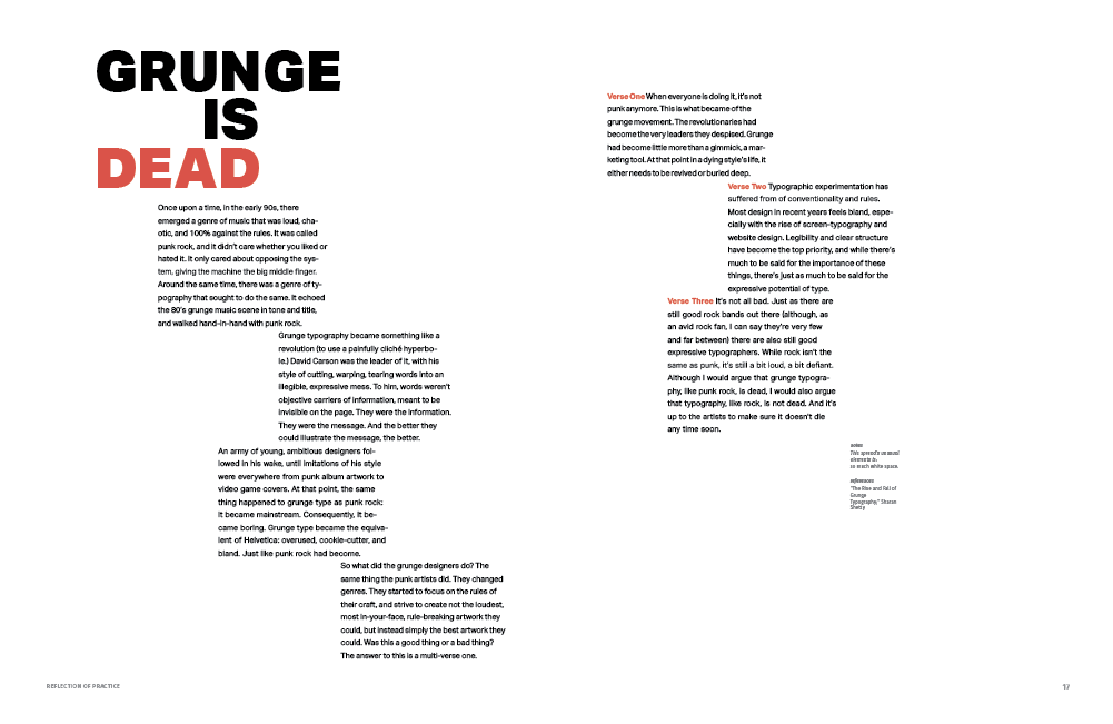
Because of the experimental nature of the book, the spreads varied from heavily typographic, to heavily illustrative. Above, I experimented with simple, clean typography, and below, I experimented with making illustrative letters.
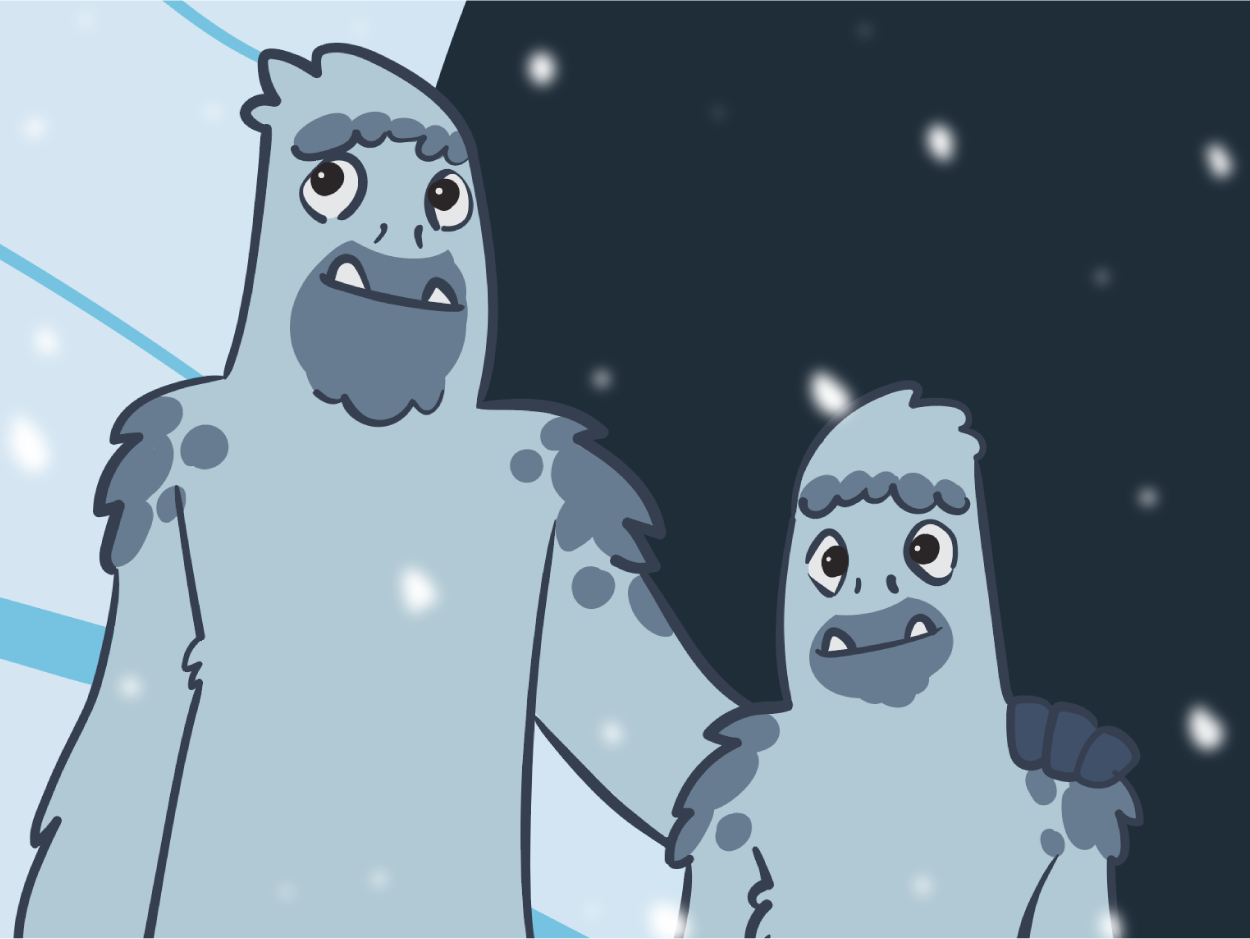
Stylish Yetis
Created for Hickory Brands, Inc. to promote their ShoeFly® brand Funsets™, this animated video aimed to appeal to young viewers and adults alike by combining imaginative imagery with a cozy scene of familial interaction. It showed that this simple product could be used by kids to bring some character to their fashion, with a little help from their parents or guardians.
I designed the video to function as both a promotion for the product, as well as a how-to guide for using the product to decorate one’s shoes.
- Date Spring 2020
- Client Hickory Brands, Inc.
- Project type illustration + animation
- Fonts used Gastramond, Usual Regular
- Outside content laptop template designed by Freepik https://www.freepik.com/free-psd/laptop-mock-up-design_1041411.htm; phone Template Designed by Daniel Bolyhos dribbble.com/dxbolyhos;
- Copyright + Trademarks The Shoefly® brand and logos are trademarks of Hickory Brands, Inc.
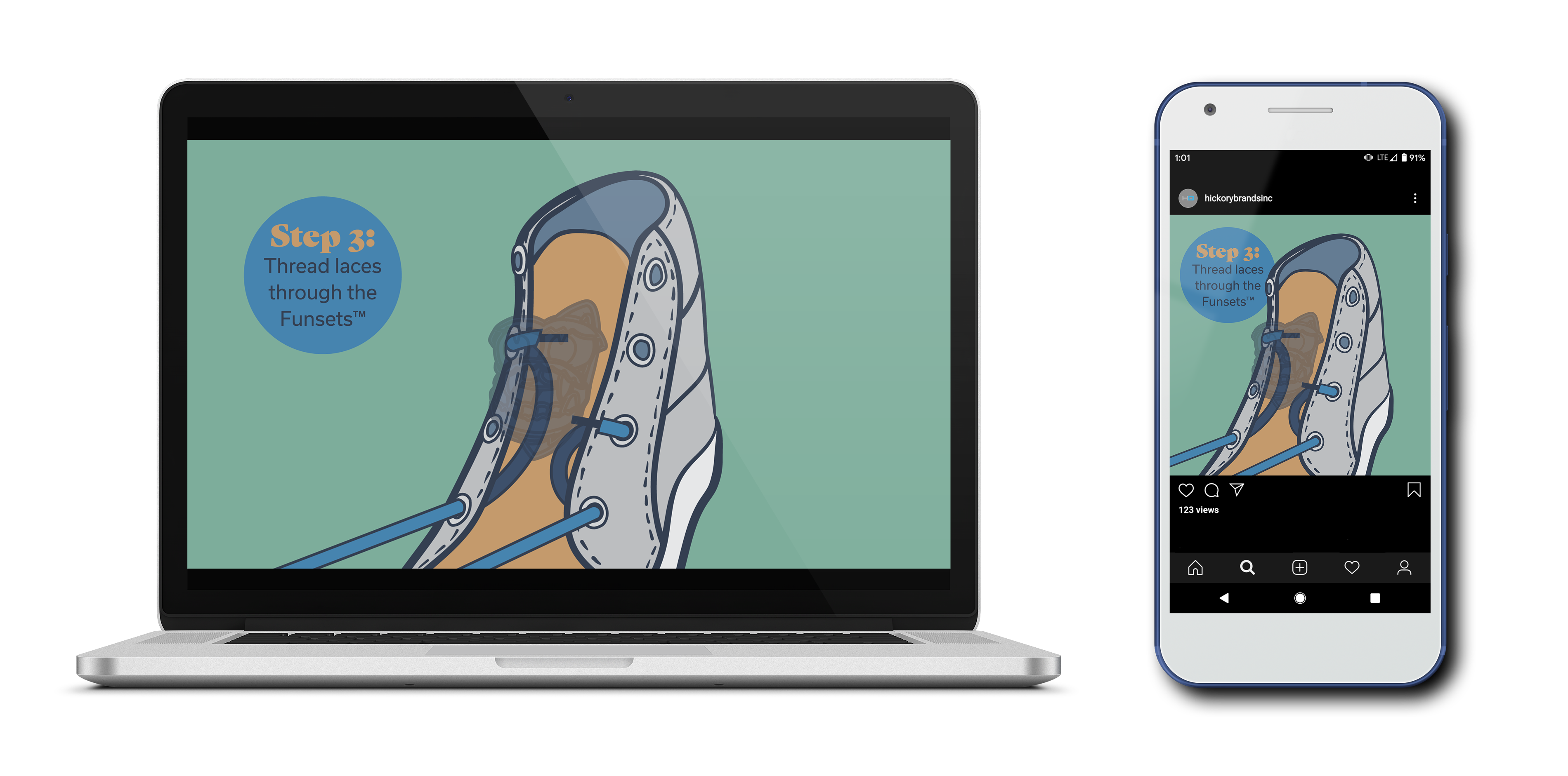
I created two version of the video, one in a YouTube aspect ratio, and one in an Instagram aspect ratio. Alternately, the video can be viewed in its Youtube format here.
I continued the series with another animated video, this time showcasing the fairy-themed ShoeFly™ brand Funsets™. Alternately, the video can be viewed in its Youtube format here.
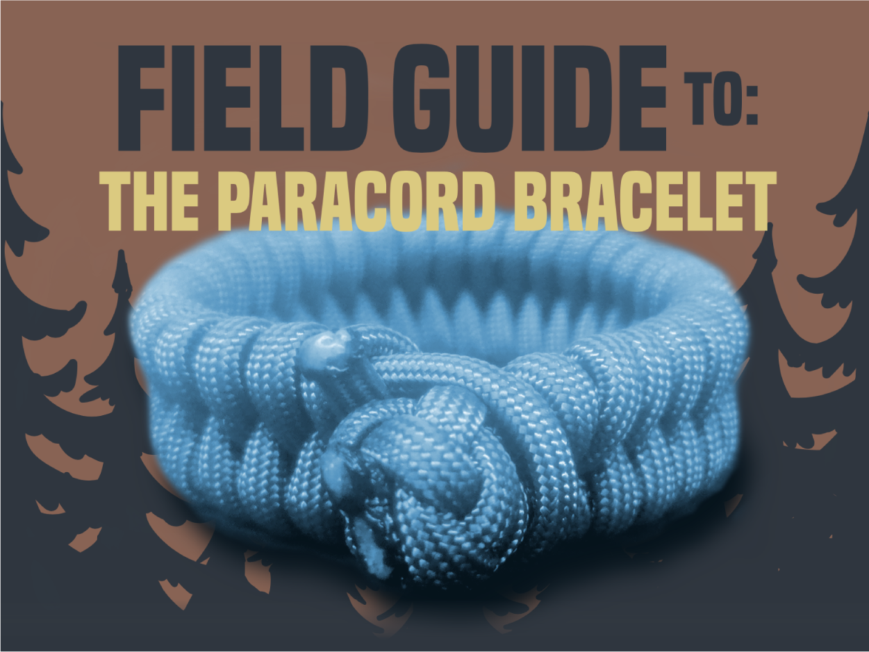
Paracord Bracelet Field Guide
Created for Hickory Brands, Inc. to promote their American Legacy® brand Paracord, this video series shows a simple way to make a paracord button-knot and paracord bracelet, both of which have many practical uses for folks who spend a lot of time on outdoor adventures.
The animated videos have a classic, outdoorsy aesthetic to appeal to the adventurous spirit and represent the longstanding American-Made brand.
- Date Spring 2020
- Client Hickory Brands, Inc.
- Project type illustration + animation
- Fonts used Built Titling, Bitter Regular
- Copyright + Trademarks The American Legacy® brand and logos are trademarks of Hickory Brands, Inc.
The videos were showcased on the company’s Instagram and Youtube accounts as part of a marketing campaign for the paracord product.
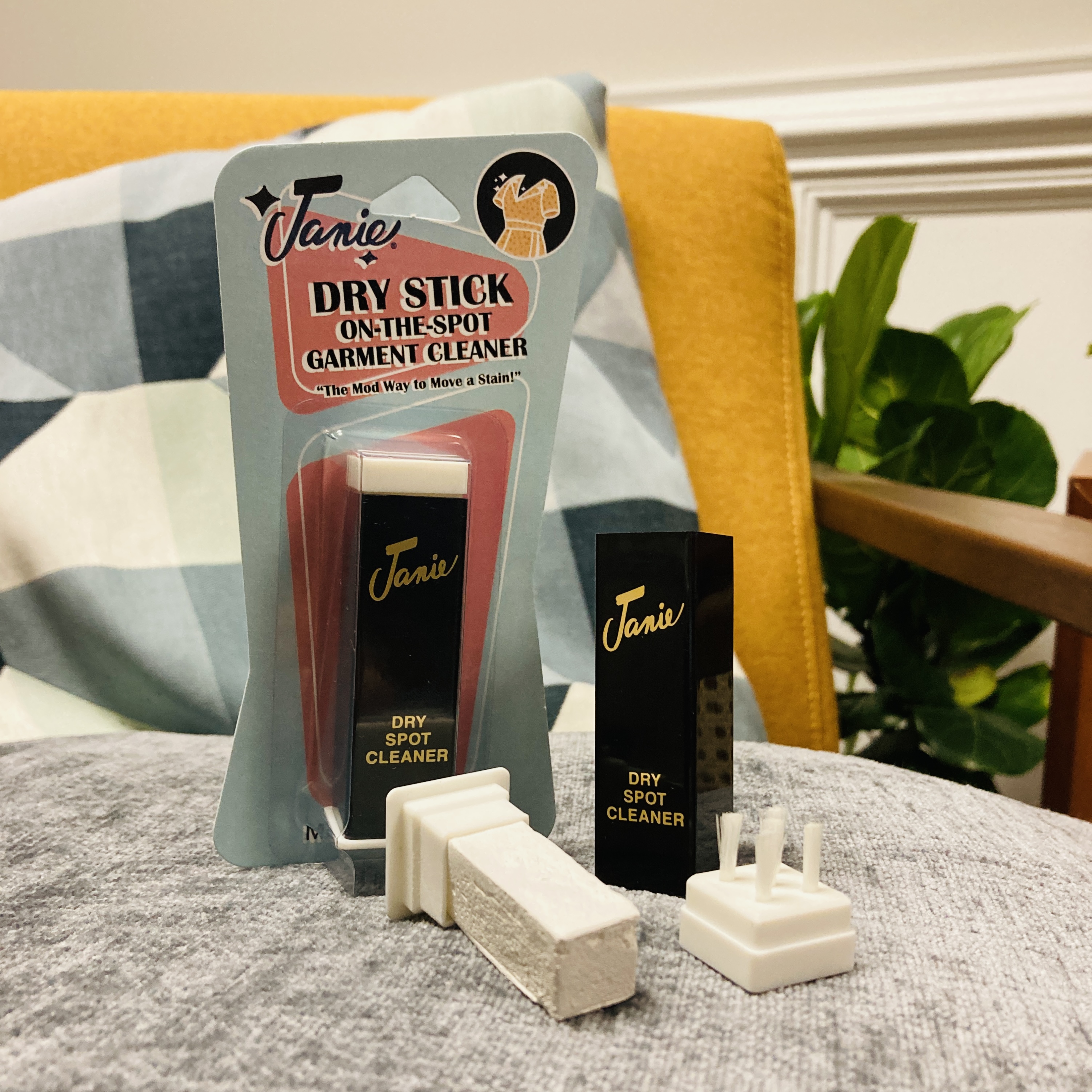

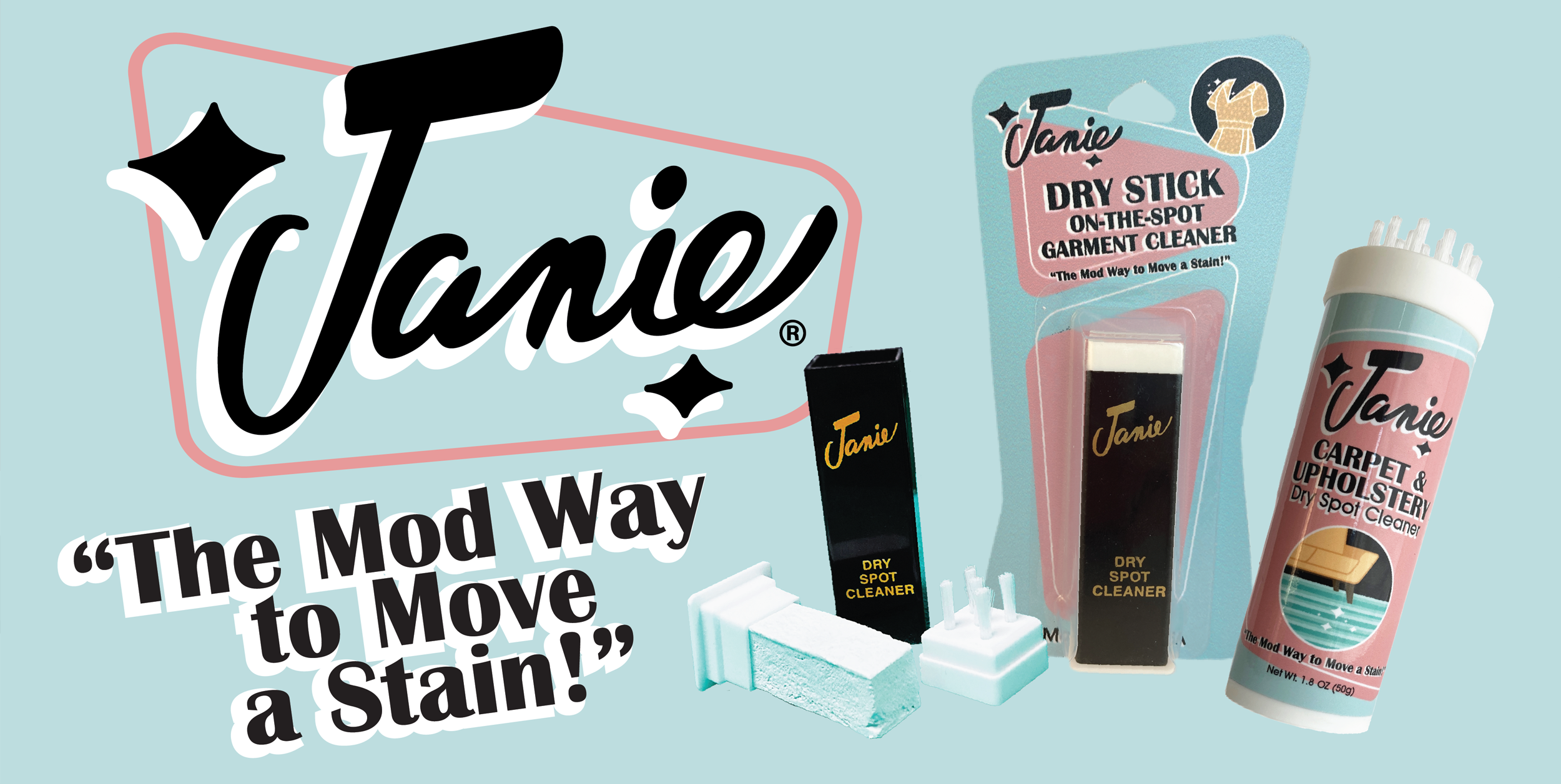
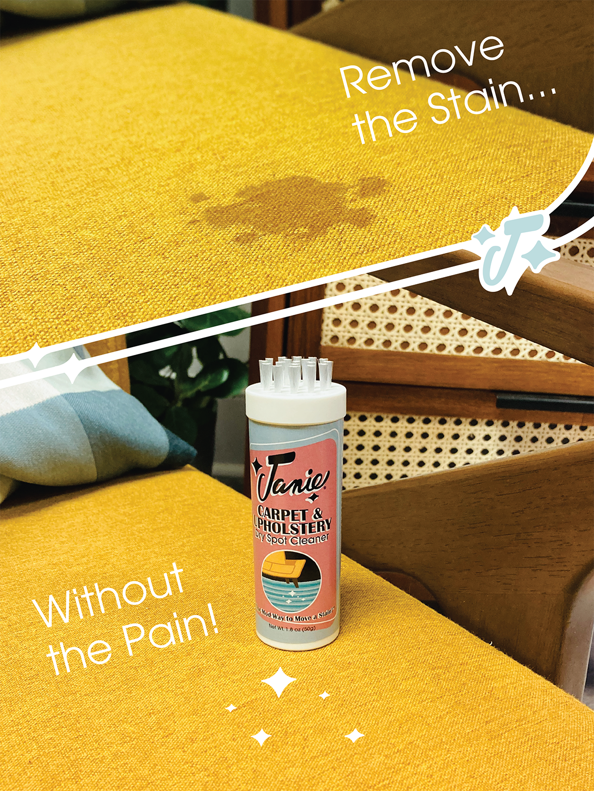
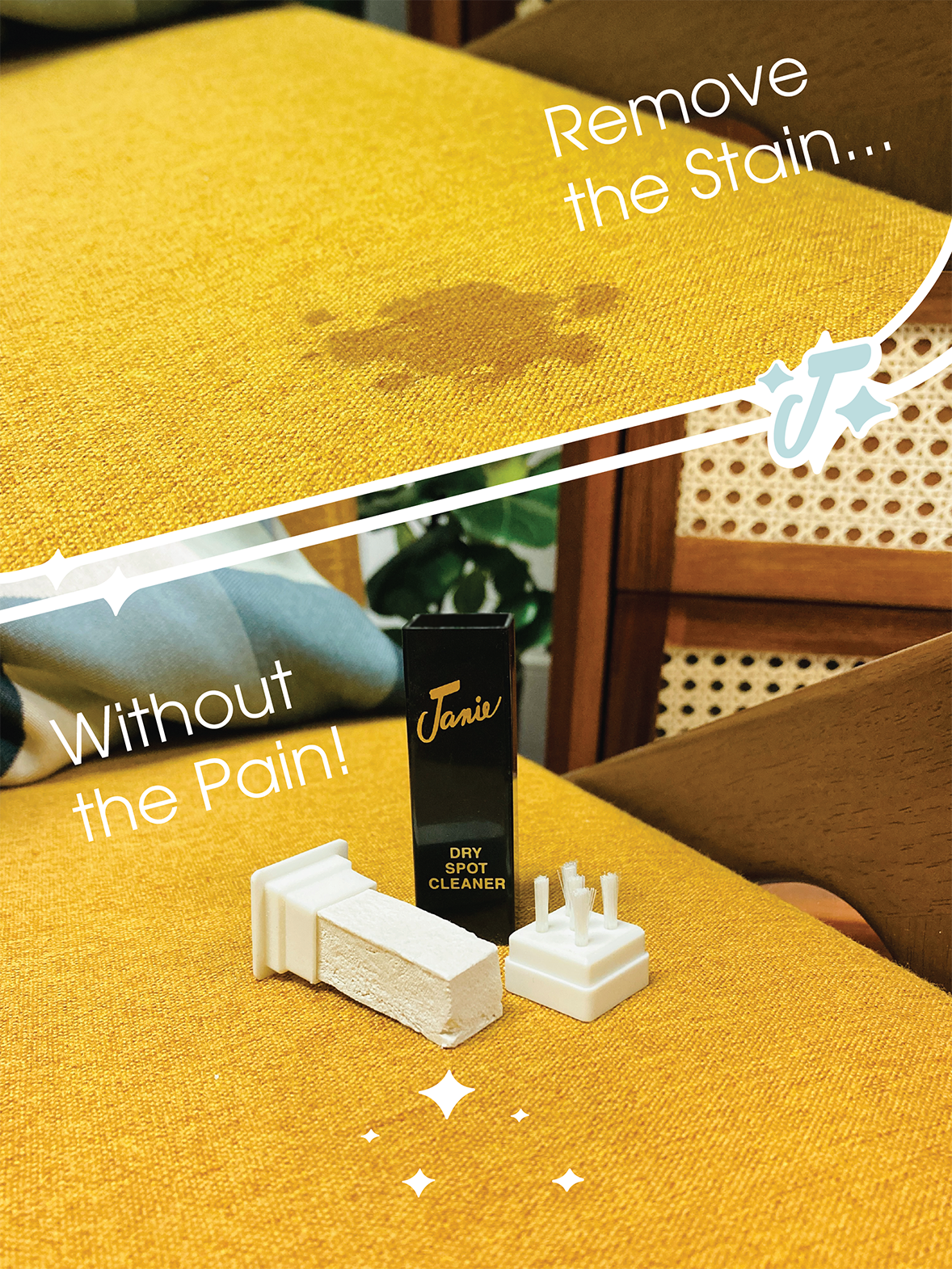
Janie® Rebrand
This classic cleaning product from the 1960's had a cult following among costume designers and actors from Broadway to Hollywood, and needed a brand-refresh for a broader market in grocery and retail channels.
With this in mind, I leaned into the 1960's story, and gave it a Mid-Century Modern flair inspired by The Jetsons and Palm Springs.
I created an updated logo, new packaging with updated colors, fonts, illustrations, and iconography, as well as ideation for an expanded product line.
- Date Spring 2022
- Client Hickory Brands, Inc.
- Project type Rebranding + Illustration + Photography
- Fonts used Britannic, Avant Garde
- Copyright + Trademark The Janie® logo and brand are trademarks of Hickory Brands, Inc.
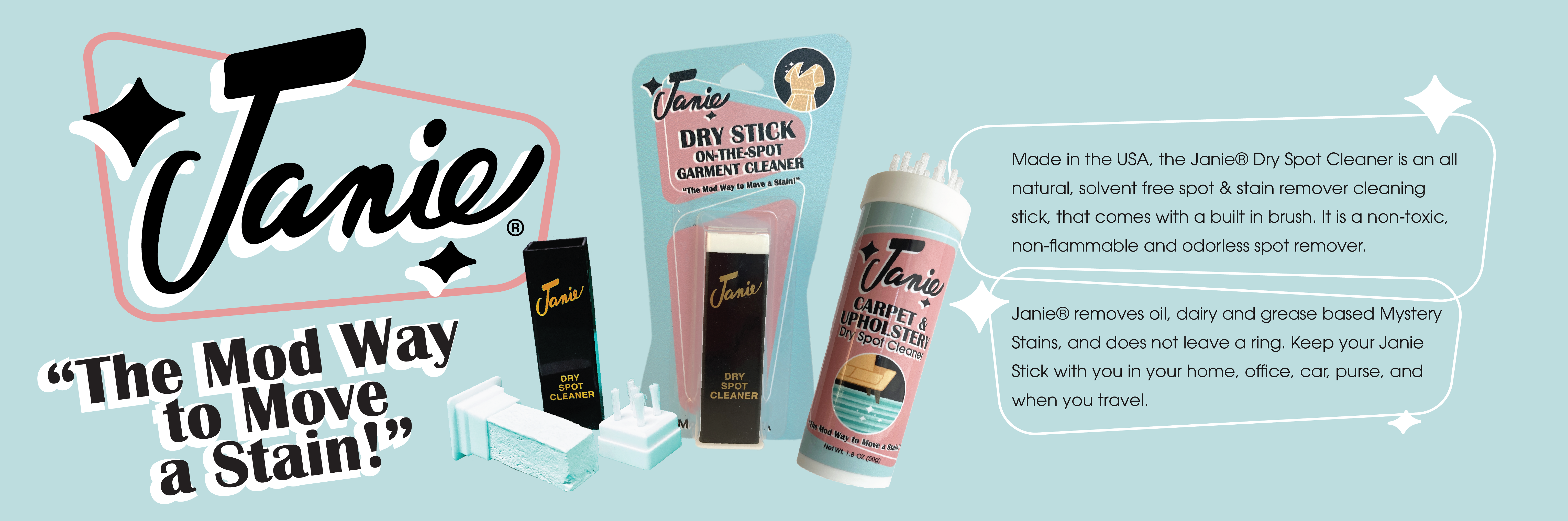
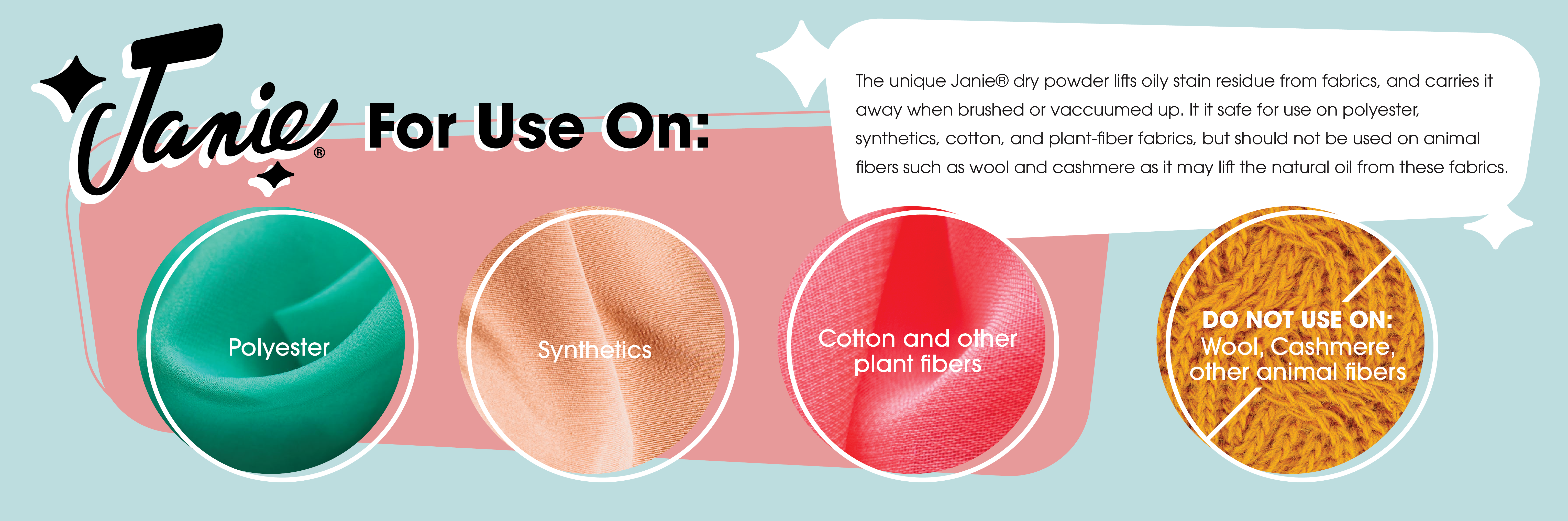
In addition to retail, Janie® would also have a life on Amazon, so I created a series of infographics to explain the product to customers.
Since the rebrand, Janie® has seen a rise in Amazon sales, and interest from many major retailers.
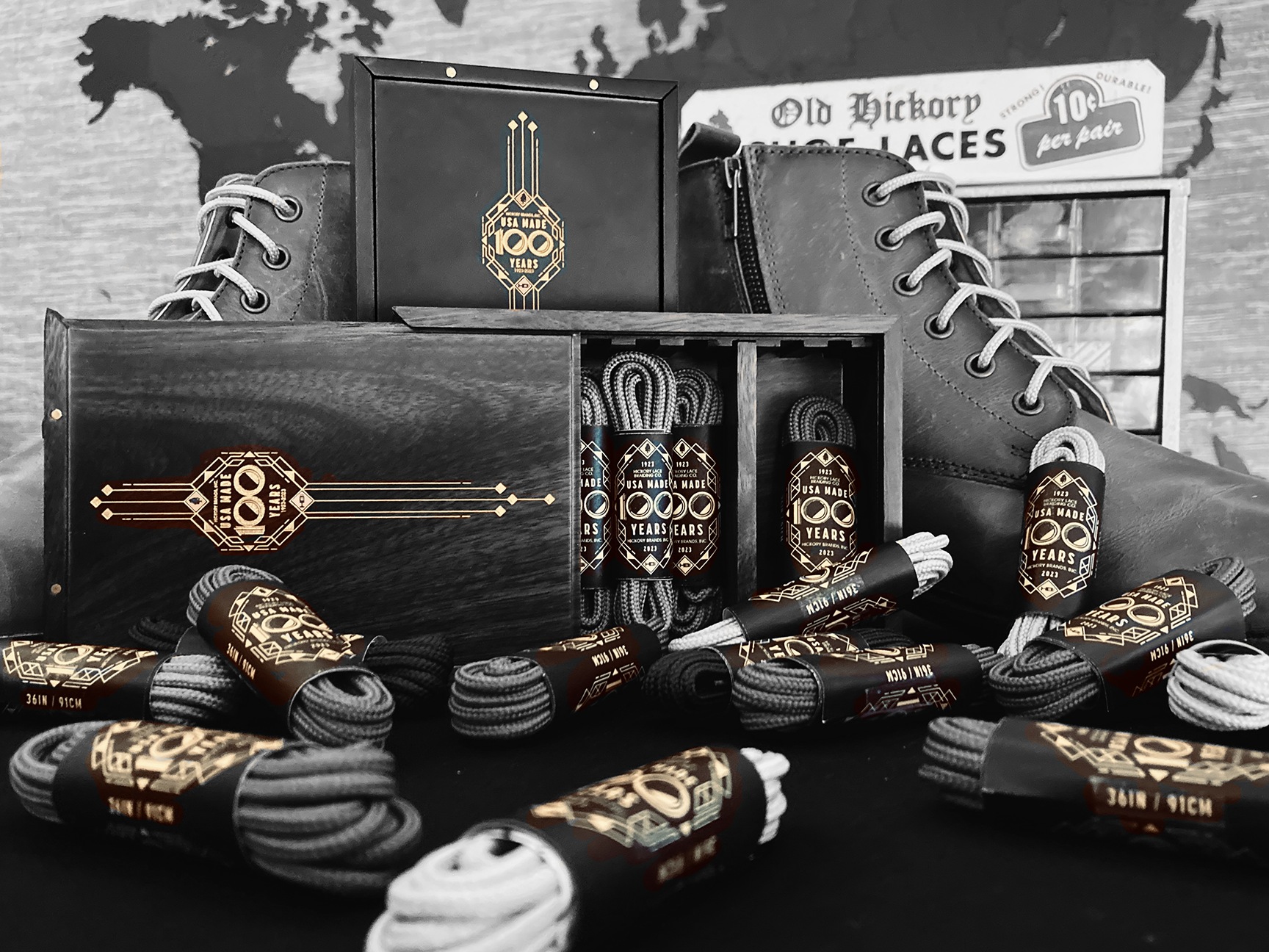
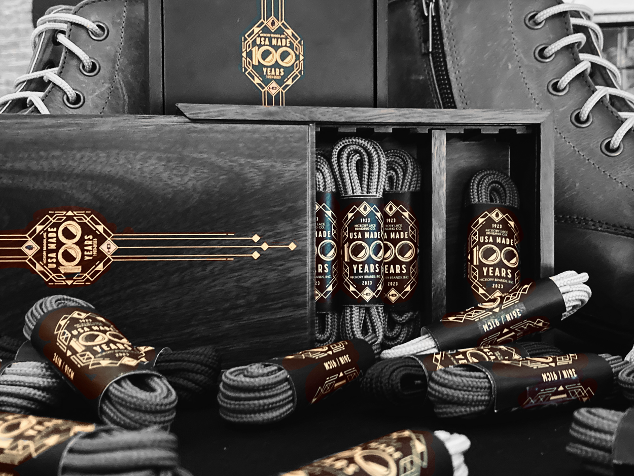
HBI 100 Year Centennial Celebration
In May of 2023, Hickory Brands, inc. celebrated 100 Years of USA Made cord, webbing, braid, shoelaces, and athletic equipment with a Centennial Celebration.
In preparation for this event, I created a collateral kit including: posters, invitations, shoelace gift-boxes, updated vinyl graphics for their Headquarters, and more.
- Date Spring 2023
- Client Hickory Brands, inc.
- Project type branding + illustration
- Fonts used Quiche Sans, ITC Avant Garde, Korolev
- Copyright + Trademarks The American Legacy®, Billsole®, Reflexall®, Shoefly®, Sneqk®, 10 Seconds®, Funk Fighters®, GoSpun®, All-Pro®, Wincord®, and Janie® brands and logos are trademarks of Hickory Brands, Inc.
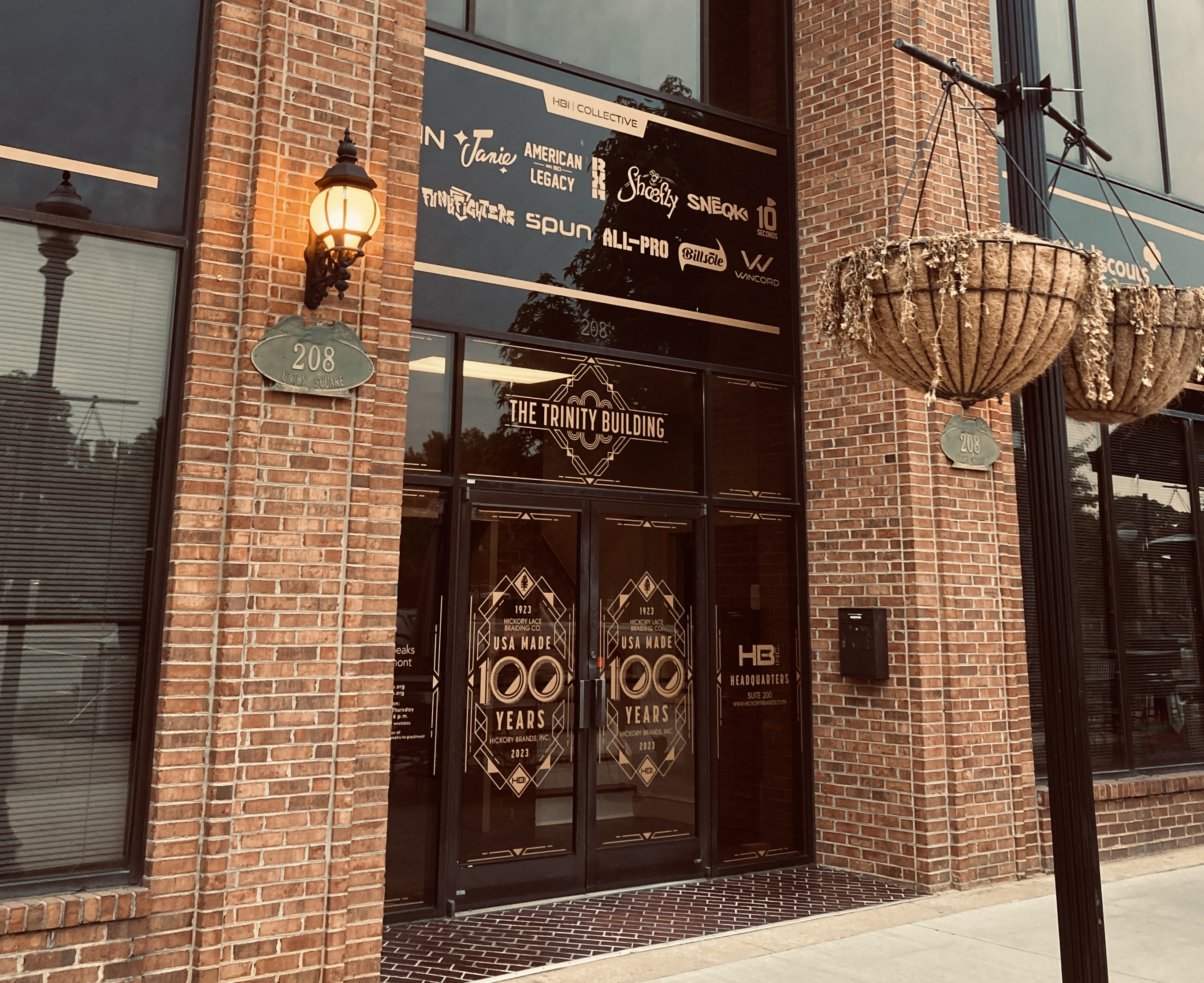
The challenge was to express both the 100-Year story with a 1920's art-deco inspired theme, and the company's humble beginnings as a shoelace manufacturer by incorporating elements of weaving patterns, and aglet-tipped line terminals.
In addition to helping tell the company's story through design and illustration, I also shot many pieces of video and photo content, researched, and wrote down much of the company's history through their "100 Days to 100 Years" social media campaign. This was a 100-post long journey on Instagram and Facebook that told each year of the company's history.
The centennial story was topped off with a 100 Year party, and several other celebratory events throughout the year, as advertized by a series of illustrated posters.